We’re past the winter solstice, heading into the second half of 2020 and a brand new financial year. We wanted to take this mid-year checkpoint to look back on the months that were (or weren’t) through the lens of our AW x FPP calendar ‘I can see clearly now’.
Filled with optical illusions our 2020 calendar was designed to encourage you to take your time, pause, and really explore every artwork within. We asked you not to flip ahead. To take no sneak peeks, rather roll with each month as it comes. We didn’t realise how fitting this sentiment would become for the first half of 2020.
Rolling into the second half of 2020, the AW crew will continue to look forward with optimism, taking each month as it comes.

JANUARY:
Imprinted by Claudio Kirac
Paper: 420gsm King Kong Hi-Bulk
Method: 4 colour process + emboss
FEBRUARY:
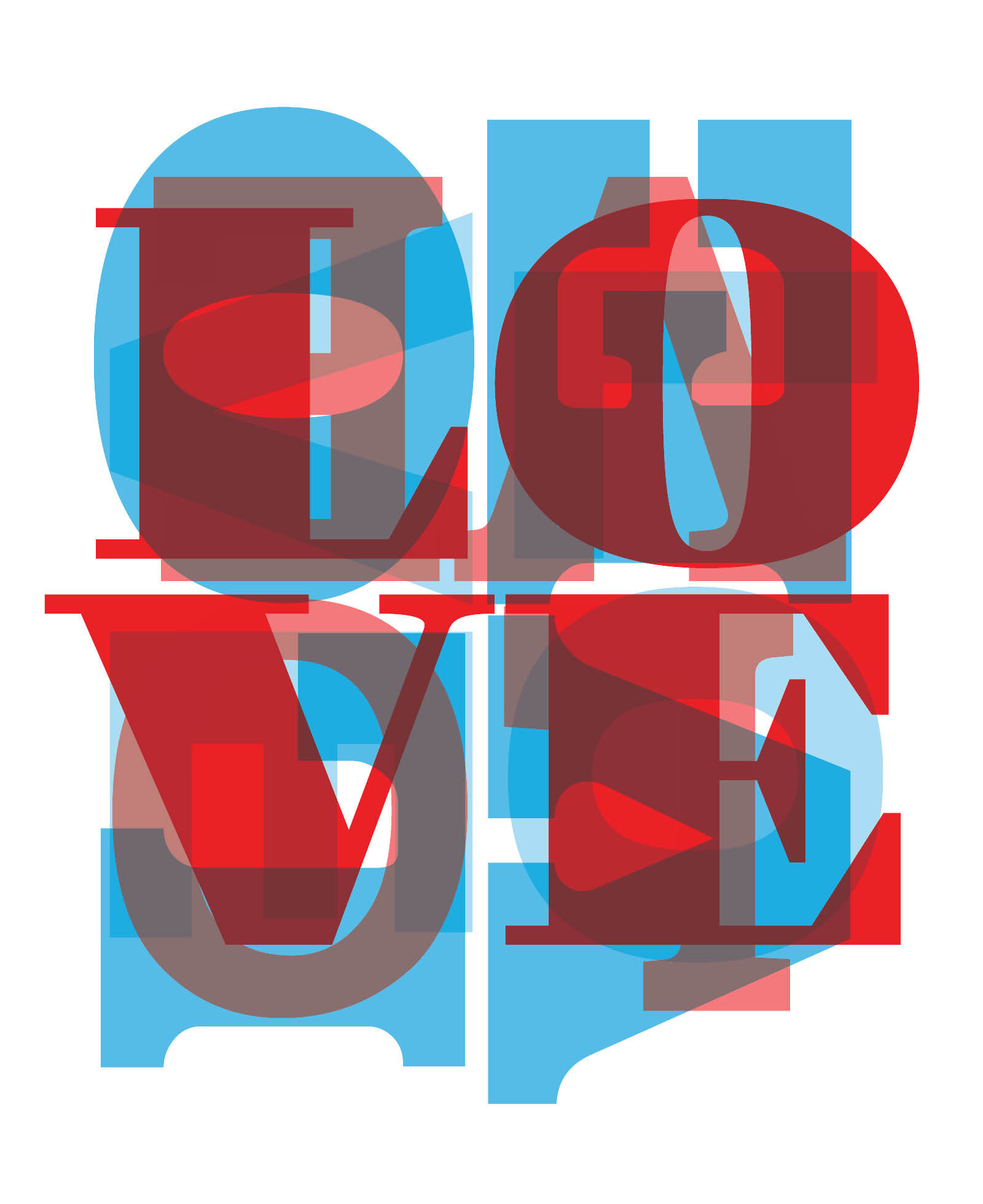
Love Letters by Emma van Zaane
Paper: 300gsm Gloss
Method: 4 colour process + gloss celloglaze

MARCH:
Where I end. Where I begin. by Claudio Kirac
Paper: 300gsm Conqueror Smooth Wove Cream
Method: 4 colour process + blue foil
'Where I end. Where I begin.' by Claudio Kirac uses the 'Poggendordd illusion'. This illusion reveals how our brains perceive depths and geometric shapes, but the cause of this optical illusion has not yet been adequately explained.
Although, no theories have satisfactorily explained this visual error, the prevailing belief is that our brain attempts to interpret a 2D image with 3D properties and distorts the depth between lines.

APRIL:
Chocolate Coma by Emma van Zaane
Paper: 300gsm Gloss
Method: 4 colour process + soft touch matt cello + textured spot uv + gloss spot uv
‘Chocolate Coma’ boasts an abundance of texture. Using a variety of different spot UV finishes is an effective method to add depth and contrast through sheen and feel.
Spot UV can be applied over inked images to enhance a printed design. Or, it can be applied directly to the paper substrate to create the design by itself, without the use of any ink. If applied directly to the paper, Spot UV offers the best contrast when applied over a darker substrate. In fact, a very popular finish combination is a high-gloss Spot UV over a dark, matte stock.
Although it can be applied to the whole card, the ‘Spot’ element of the process is worth mentioning. This is the practise of picking out a particular element of the design to give a great contrast, making long-lasting impact. Spot colours are used to identify the specific area and can be as specific as a one-point line.

MAY:
Butterfly Effect by Emma van Zaane
Paper: 300gsm Gloss
Method: 4 colour process + layered emboss + red foil

JUNE:
Which line is longer? by Claudio Kirac
Paper: 200gsm matt
Method: 4 colour process + matt celloglaze